IMPULSE MUSIC FESTIVAL

Overview
Chapman University challenged students to design an eco-sustainable music festival concept that emphasized environmental responsibility while delivering a memorable and engaging attendee experience. For this project, designers were paired with specific companies, and I was assigned Rivian, the eco-friendly, battery-powered vehicle manufacturer.
Approach
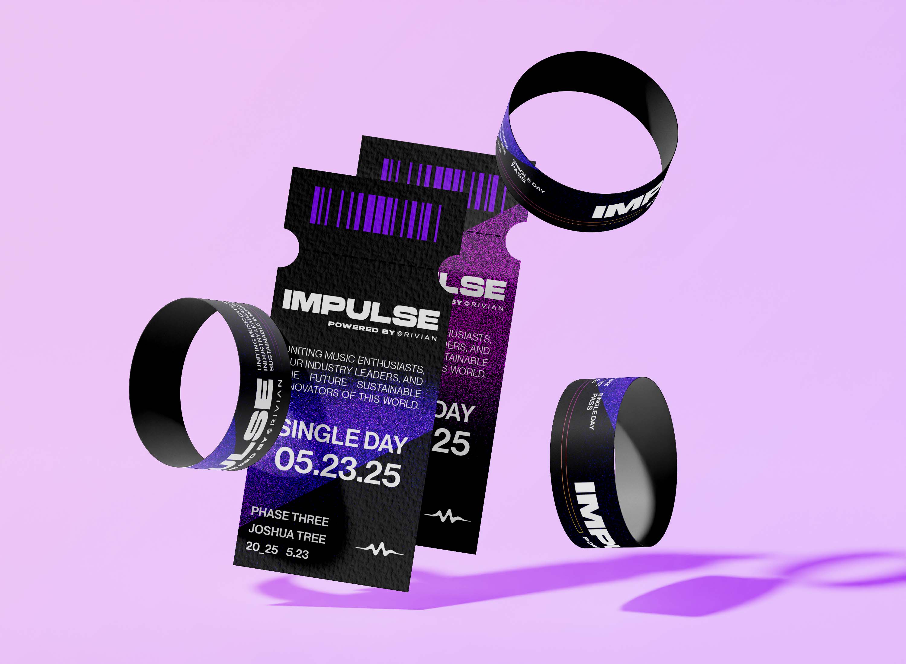
In designing IMPULSE, choices that aligned with the festival’s core values of sustainability, innovation, and immersive musical experiences were used. The bold typography featured in the logo and marketing materials embodies the festival's dynamic, progressive energy. A color palette of purple, yellow, and chrome was selected to convey a futuristic, edgy aesthetic while maintaining an air of sophistication and elegance. This vibrant scheme not only draws attention but also ensures cohesion across physical and digital assets, reinforcing the festival’s identity as an eco-conscious and technologically advanced event.
Clean and minimal layouts were integral to the user experience, ensuring all festival information—from artist lineups to ticketing—was intuitive and accessible. Both the website and physical promotional materials employed consistent vertical text alignments and monochromatic photography, creating a sleek and focused visual hierarchy. Black-and-white artist photos provided a timeless contrast to the bold purples and chromes, spotlighting the performers while complementing the futuristic design theme. By eliminating unnecessary visual clutter, the design emphasized clarity and usability, allowing attendees to quickly access essential details, such as performance schedules and ticket options, without compromising on aesthetic appeal.


